In the crowded world of online video content, grabbing a viewer’s attention in mere seconds can make or break your success. You could spend hours scripting, filming, and editing your video, but if your thumbnail fails to stand out, viewers might scroll right past it. That’s why an effective thumbnail is more than just a pretty picture it’s your first impression, your hook, and your secret weapon.
Whether you’re uploading videos to YouTube, sharing reels on social platforms, or creating content for marketing campaigns, mastering thumbnail design is essential. In this blog, we’ll dive deep into smart thumbnail strategies you can use to drive more clicks and improve your content’s visibility.
Why Thumbnails Matter More Than You Think
Before diving into design techniques, let’s understand why thumbnails hold so much power. Think of them as mini billboards. They visually summarize your content and compete with thousands of others on users’ screens. An engaging thumbnail can significantly increase your click-through rate CTR, especially when paired with compelling titles.
Most users decide whether to click based on two things: the thumbnail and the title. However, studies suggest that thumbnails may influence the decision more heavily since they grab the eye first. That’s why even the most engaging video might go unnoticed without an eye-catching thumbnail.
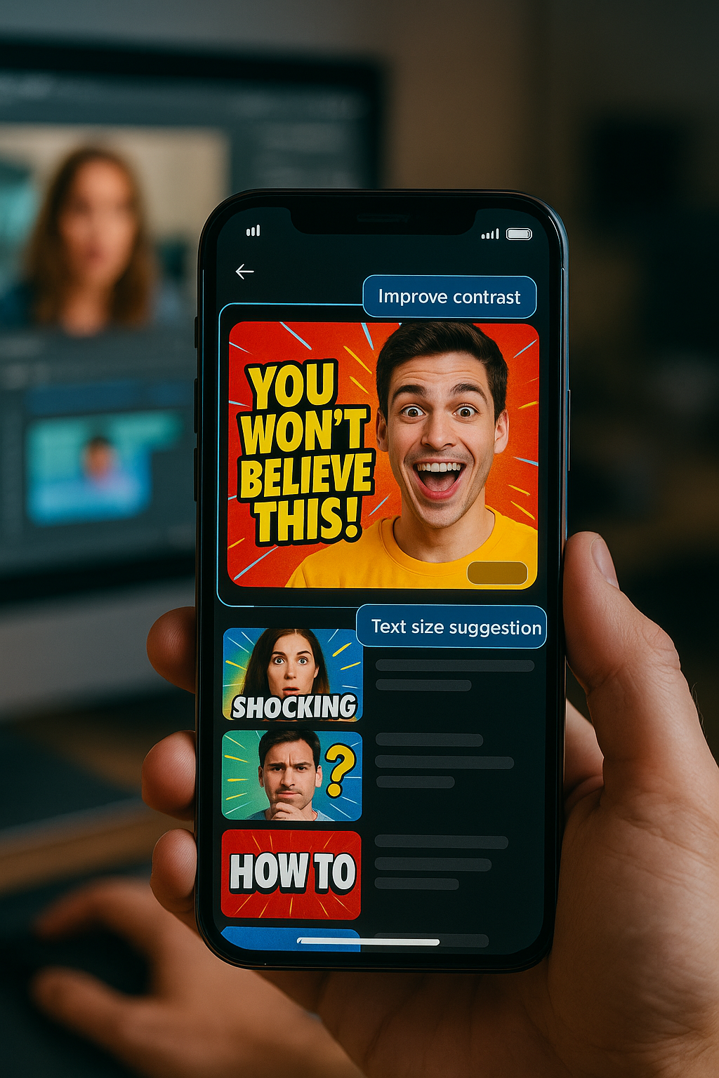
Start with a Purposeful Thumbnail Maker Strategy
When it comes to creating thumbnails, strategy matters just as much as style. Many creators today rely on a thumbnail maker to quickly produce compelling visuals that match their video content. Tools like invideo AI are evolving to assist creators in designing thumbnails that are both visually appealing and algorithm-friendly. While the goal isn’t to promote any one tool, it’s worth noting that AI-powered platforms are helping users create thumbnails tailored for maximum impact, saving time while boosting creativity.
So what makes a thumbnail click-worthy? It’s all about composition, emotion, clarity, and relevance. Let’s unpack each of these with actionable techniques.
Use Faces and Expressions to Connect Emotionally
Emotions Drive Clicks
Human faces are powerful visual cues. Thumbnails featuring expressive faces tend to perform better because they evoke emotion and invite curiosity. A surprised face, a shocked expression, or intense eye contact can increase engagement because they generate questions in the viewer’s mind: Why is this person shocked? What happened?
If your video includes people, make sure to capture a frame with a strong emotional expression. You can zoom in slightly on the face to make it the central focus. Combine this with clean background contrast to ensure the emotion shines through without distractions.
Add Bold, Readable Text but Keep It Minimal
Less Is More
Text on thumbnails should amplify the message without overwhelming the viewer. Instead of cluttering the thumbnail with full titles or paragraphs, stick to short, punchy words or phrases usually 3 to 5 words. These should either tease the content or pose an intriguing question.
Use large, bold fonts with strong contrast against the background. Think about legibility across all devices, especially smartphones, where most users consume content. Bright colors like yellow or white against dark backgrounds often perform well.
Contrast and Color Psychology in Thumbnails
Color choice isn’t just about aesthetics it’s psychological. Different colors elicit different emotions:
Red can convey excitement or urgency.
Blue often feels trustworthy and calm.
Yellow grabs attention and feels energetic.
Green suggests growth or success.
Use colors intentionally to align with the video’s tone. Don’t be afraid to increase saturation slightly during editing to make your thumbnail pop against a sea of muted visuals.
Composition Techniques That Stop the Scroll
Rule of Thirds and Visual Balance
Professional designers often use the rule of thirds a technique where the frame is divided into a 3×3 grid—to compose visuals that feel naturally balanced. Place key elements like faces or text at the intersections of the grid to draw the viewer’s eye in.
Also, avoid clutter. Thumbnails with too many competing elements look chaotic and can be ignored. Maintain visual hierarchy by placing one dominant element such as a face, object, or headline and supporting elements around it.
Context is Key
Misleading thumbnails also known as clickbait may generate initial clicks but hurt long-term engagement and trust. Make sure your thumbnail represents the actual content. It should serve as a visual summary or teaser of what the viewer is about to watch.
This doesn’t mean you can’t be creative. In fact, exaggeration or stylized visuals are often helpful as long as they’re rooted in truth. Viewers should feel satisfied after clicking, not tricked.
Make Use of AI-Powered Features
While we’re not focusing on any specific tools, it’s important to mention that artificial intelligence has made creating high-quality thumbnails much easier. From automatic cropping to background enhancement, today’s AI tools provide suggestions based on popular formats, which streamlines the design process.
Optimize Thumbnails for Mobile Viewing
Most views happen on mobile devices, where screen space is limited. If your thumbnail isn’t optimized for small screens, it may lose effectiveness. Follow these best practices for mobile-friendly thumbnails:
Use bold and legible fonts
Keep the design uncluttered
Focus on high contrast elements
Avoid overly detailed backgrounds
Preview your thumbnail at reduced sizes to ensure it’s still compelling and readable at a glance.
Integrate with Your Video Making Workflow
Smart Workflow = Better Consistency
A great thumbnail doesn’t exist in isolation. It should align with your video’s title, description, and tone. Many creators who use video making apps integrate thumbnail design into their overall workflow. This allows them to match visual styles, branding, and messaging across all assets.
Planning your thumbnail before editing the video can also guide how you shoot and what key frames you highlight. For instance, if you plan to showcase a dramatic reaction in your thumbnail, make sure to record those moments with high resolution and clear lighting.
Test and Analyze Thumbnail Performance
Creating the perfect thumbnail isn’t a one-time task it’s an ongoing experiment. Run A/B tests when possible. Try different colors, text styles, or compositions and compare performance metrics such as CTR click-through rate, average view duration, and engagement.
Platforms that support thumbnail swapping allow you to test variants and make data-driven decisions. Over time, you’ll learn which styles resonate most with your audience, and you can refine your approach accordingly.
Branding Without Being Repetitive
Consistency in your thumbnails helps build brand recognition. This could be as simple as using a recurring color scheme, a border style, or placing your face in the same position across videos. However, avoid making them too identical each should still feel fresh and relevant to the specific video.
You don’t need to plaster logos or taglines everywhere. Subtle branding works best. Think of it as seasoning rather than the main dish.
Keep Up with Design Trends
Thumbnail trends evolve. Stay updated by analyzing successful channels or creators in your niche. Some recent trends include:
Cutout-style images with drop shadows
Vibrant neon outlines
Overlays of countdown timers or question marks
Split-screen effects
Adapt what works, but make it your own. Blindly copying others can dilute your uniqueness. Find a visual language that fits your content voice and audience.
Final Thoughts
In a fast-paced digital world, attention is a limited currency. Your thumbnail is your first and often only chance to earn a click. By using the tricks shared above emotive visuals, strategic text, color psychology, and clean composition you can significantly improve your chances of standing out.
A smart thumbnail maker strategy can streamline your design process and align your visuals with your brand. Combine that with thoughtful planning and analytics, and you’ll be on your way to boosting video clicks organically.
And remember, while tools and techniques are important, the real key is knowing your audience. Create thumbnails that speak to their interests, emotions, and curiosity. That’s where the magic begins.